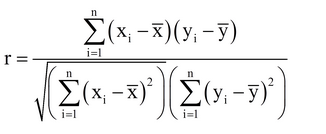
Correlation
You have a set of data points. Make sure it’s normally distributed -> (eg. Take log returns). Then you measure the correlation of the data points.
Place the data points on a scatter plot (as you can see below).
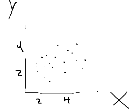
The scatter plot shows us the distribution of data.
EXAMPLE: Let’s say on the x axis is the amount of job experience different people have and on the y axis is the amount of money you earn each month.
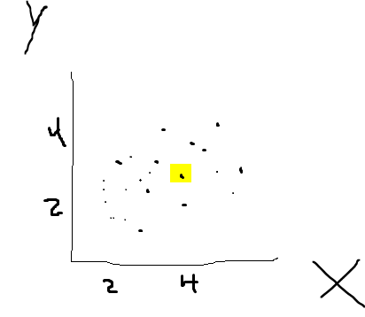
For example this point is one person. He has 4 years of job experience and earns like 3,8. Each point is another person.
Just by looking at this data, we can already assume there is a relationship between job experience and the amount of money one earns.
The strength of this relationship can be shown by calculating the correlation coefficient which can have values between -1 and 1.
Values close to 1 (or -1) indicate a strong positive (negative) relationship and values close to 0 indicate a weak relationship.